
Why Strong Brands Start with Identity
Every successful brand has a story, personality, and presence that goes far beyond a logo or a catchy slogan. Brand identity is the backbone of any thriving business, shaping how you are perceived, remembered, and trusted by your audience. Let’s explore why strong brands always begin with identity.
What Brand Identity Really Means
Brand identity is much more than a visual mark or trademark. It’s the comprehensive set of elements that define how a brand looks, sounds, and feels to its audience. This includes the brand’s values, voice, messaging, color palette, typography, and even customer experience. Essentially, brand identity is the sum of how a brand presents itself and how it wants to be perceived in the market.
Why First Impressions Matter
First impressions are powerful. When someone encounters your brand for the first time—whether through your website, packaging, or even a simple business card—they form an immediate opinion. This initial encounter can set the tone for the entire relationship. A clear, authentic brand identity makes a positive first impression that can shape long-term perception, influencing whether someone chooses to engage further or move on.
The Power of Consistency
Consistency is the secret ingredient that transforms a brand from a fleeting encounter into a trusted presence. When every touchpoint—from your social media posts to your customer service emails—reflects your brand’s identity, you build recognition. Over time, this recognition establishes trust and loyalty, leading to better client retention and a stronger reputation. Inconsistent branding creates confusion and dilutes trust.
Identity and Trust: An Unbreakable Link
Trust is the foundation of any lasting relationship, and brands are no different. A well-defined and consistently presented identity signals reliability and professionalism. Customers are more likely to choose and stick with brands they recognize and trust. When your brand’s identity is clear and unwavering, your audience feels confident in what you promise; and what you deliver.
Lessons from Iconic Brands
Consider brands like Coca-Cola, Apple, and Nike. Their identities are instantly recognizable, not just because of their logos, but because every aspect of their communication, product design, and customer interaction reflects a unified brand persona. These companies have built decades of trust and loyalty by staying true to their core identity across every touchpoint.
Conclusion
A strong brand identity is the foundation on which memorable, lasting brands are built. It’s more than just visuals, it’s about values, consistency, and trust. By investing in a clear and authentic identity from the start, brands lay the groundwork for long-term recognition, customer loyalty, and success.
SEO and AEO Basics for Small Businesses: 5 Steps to Improve Your Google Rankings
If you run a small business, especially one that serves a specific or niche audience, it can feel like showing up on Google is a challenge.
But here is the good news.
You do not need to compete with everyone. You just need to show up for the right people.
That is where the fundamentals of Search Engine Optimization (SEO) and Answer Engine Optimization (AEO) come in. When done right, they help your business appear exactly when your ideal customer is searching for your expertise.
Before advanced tactics, it all starts with a strong foundation.
Here are five practical ways to improve your visibility, especially if your audience is more targeted or specialized.
1. Use Titles That Reflect What You Actually Do (and Who You Serve)
Your page title tells Google and your audience what your business is about.
For niche businesses, clarity is more important than cleverness.
What to do:
Be specific about your service and audience
Include your location if relevant
Avoid generic titles like “Home” or “Services”
Example:
Instead of:
“Consulting Services”
Try:
“HR Consulting for Manufacturing Companies in Michigan”
Why it matters:
The more specific your title is, the easier it is for Google to match you with users searching for exactly what you offer. This is especially true in niche markets where relevance matters more than volume.
2. Write Meta Descriptions That Speak to the Right Audience
Your meta description is your chance to tell someone, “This is exactly what you are looking for.”
For niche businesses, this is where you stand out.
What to do:
Speak directly to your ideal client
Highlight what makes you different
Keep it clear and conversational
Example:
“Specialized HR support for manufacturing teams. Practical solutions designed for complex operational environments.”
Why it matters:
You do not need more clicks. You need the right clicks. The right language attracts the right audience.
3. Create Content That Answers Specific Questions (AEO)
This is where niche businesses have a major advantage.
Your audience likely has very specific questions, and fewer businesses are answering them well.
What to do:
Focus on real, detailed questions you hear from clients
Use those questions as headings in your content
Provide clear, direct answers
Examples:
“What type of insurance do independent contractors need?”
“How does DOT compliance work for small trucking fleets?”
“What should I expect during a full-mouth dental restoration?”
Why it matters:
Google and AI-driven search tools prioritize content that directly answers user intent. The more precise your answers, the more likely you are to become the result that gets surfaced.
4. Make Sure Your Website Works Seamlessly on Mobile
Even highly specialized audiences are searching on their phones.
If your site is hard to use, it creates friction, and that affects both rankings and conversions.
What to do:
Ensure pages load quickly
Make navigation simple
Keep text readable without zooming
Why it matters:
A smooth mobile experience builds trust immediately. For niche audiences, that first impression often determines whether someone reaches out or keeps searching.
5. Strengthen Your Google Business Profile for Local Visibility
If your business serves a geographic area, your Google Business Profile is critical.
For niche businesses, it is also a chance to reinforce your specialization.
What to do:
Keep all information accurate and updated
Add photos that reflect your work or environment
Use descriptions that highlight your focus or niche
Respond to reviews thoughtfully
Why it matters:
When someone searches locally, they are often ready to act. A strong, specific profile helps you stand out as the most relevant and credible option.
The Bottom Line: Specific and Consistent Wins
You do not need to show up for everyone, just the right audience.
The businesses that perform well in search today are the ones that:
Clearly define what they do and who they serve
Create content that answers real, specific questions
Show up consistently with useful, relevant information
SEO and AEO are not about quick tricks or broad visibility.
They are about clarity, consistency, and relevance.
Start with these fundamentals, and over time, you will build a stronger presence with the people who matter most to your business.
If your business serves a specific audience, we can help you identify exactly what they are searching for and build a strategy that positions you as the clear answer.
Why Your Website Isn’t Showing Up on Google (And What You Can Do About It)
You built a website. It looks good. It’s live.
So why isn’t it showing up on Google?
This is one of the most common questions we hear from clients. The truth is, there is rarely a single reason. Most of the time, it comes down to a few key issues that are easy to overlook but are completely fixable once you know what to look for.
Let’s walk through the most common reasons your website is not showing up and what you can do about it.
1. Google Has Not Indexed Your Site
Before your website can rank, Google has to find it.
If your site is not indexed, it simply will not appear in search results.
How to check
Go to Google and search:
site:yourdomain.com
If nothing comes up, your site likely has not been indexed yet.
Why this happens
Your site is brand new
You have not submitted it to Google
There is a technical setting blocking search engines
What to do
Set up Google Search Console
Submit your sitemap
Make sure there are no “noindex” tags or blocked pages
2. You’re Not Using the Right Keywords
A common mistake businesses make is writing for themselves rather than for their audience.
You might describe your services one way, but your customers search in an entirely different language.
For example, you might say “strategic communications,” while someone is searching “marketing agency near me.”
What to do
Research how your audience actually searches
Use tools like Google Keyword Planner or Semrush
Focus on clear, specific phrases with intent
The goal is simple. Speak your customer’s language.
3. Your SEO Basics Are Missing
Search engines rely on structure and signals to understand your website. If those signals are missing, your visibility will suffer.
Common issues include
Missing or weak page titles
No meta descriptions
Poor use of headings
No image alt text
What to do
Make sure every page:
Targets a clear keyword
Has a strong, relevant title
Is easy to scan and understand
Good SEO is not complicated, but it does require attention to detail.
4. Your Content Is Not Strong Enough
Google prioritizes content that is helpful, relevant, and actually answers questions.
If your site has thin, outdated, or generic content, it will struggle to rank.
Signs this might be the issue
Short pages with little substance
Content that repeats what everyone else is saying
No blog or ongoing updates
What to do
Create content that answers real questions
Go deeper on topics instead of staying surface-level
Add blogs, insights, and updates regularly
Think of your website as a resource, not just a brochure.
5. Your Website Has Technical Problems
Sometimes the issue is not what your site says, but how it functions.
Common technical problems
Slow load times
Broken links
Poor mobile experience
Errors that prevent Google from crawling pages
What to do
Run a site audit using tools like Google PageSpeed Insights
Fix errors that impact performance
Make sure your site works well on mobile devices
Even small technical improvements can make a big difference.
6. Your Website Lacks Authority
Google favors websites it trusts.
If your site is new or has few external links pointing to it, it may struggle to compete.
What builds authority
Backlinks from reputable websites
Media coverage and PR
Consistent, high-quality content
What to do
Earn links through partnerships and PR
Publish content that others want to reference
Stay consistent over time
Authority builds slowly, but it is one of the most important factors.
7. You’re Not Showing Up Locally
If you are a local business, local search matters just as much as your website.
Key pieces you may be missing
A fully optimized Google Business Profile
Consistent business listings
Reviews from customers
What to do
Claim and optimize your Google Business listing
Keep your name, address, and phone number consistent
Ask happy clients to leave reviews
Local visibility can often be improved quickly with the right steps.
8. You’re Expecting Immediate Results
This might be the hardest part.
SEO takes time.
Even when everything is done right, it can take weeks to get indexed and months to start seeing strong rankings.
Consistency is what wins here.
Final Thoughts
If your website is not showing up on Google, it is not random. There is always a reason, and more importantly, there is always a solution.
In most cases, it comes down to a mix of visibility, relevance, and trust.
At Premier Communications Group, we help businesses identify exactly what is holding their website back and build a strategy that gets results.
Ready to Get Found?
If your website is not working as hard as it should, it might be time for a different approach.
Let’s start the conversation. Contact Us or explore our Website and Digital Services to learn where your online presence stands and what steps can help improve your visibility.
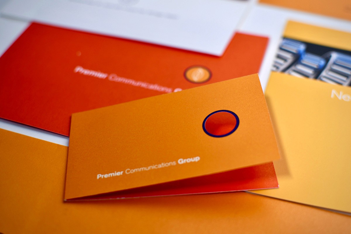
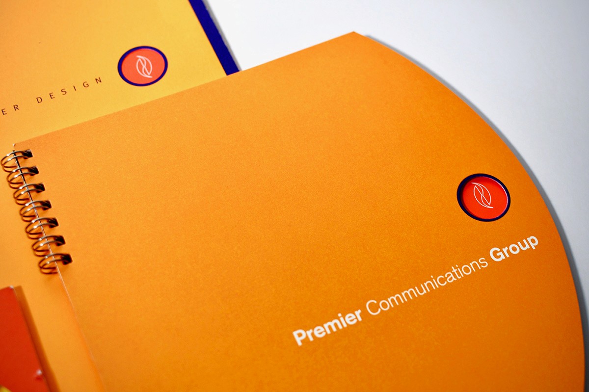
How Premier’s Logo Evolved: A 40-Year Journey of Brand Growth
Understanding Brand Evolution: Why Your Logo Tells Your Story
Every company has a story, and your logo is often the first visual chapter. At Premier, we’ve been refining our brand identity for over 40 years. With each logo redesign, we asked the same questions: What’s new? What’s timeless? How can our brand reflect who we are today while honoring our history?
A brand refresh isn’t just about a new logo or color palette. It’s about clarity, intention, and capturing the growth of a company over time. Before moving forward, we took a step back to revisit where it all began.
Digging Into Our Branding History
As the process began, we opened the Premier archives. Old stationery. Early logos. Campaign pieces from years past. Some of it had a bit of dust on it—but it also carried decades of history.
Each piece represented a moment in time. A design choice. A milestone. A snapshot of where the company was and where the design world was heading. Over four decades, those moments quietly build a visual timeline of a brand. To understand where we are today, it helps to see where it all started.
1984: The Beginning of Premier’s Brand
Our earliest logo reflected the design trends of the early 1980s almost perfectly.
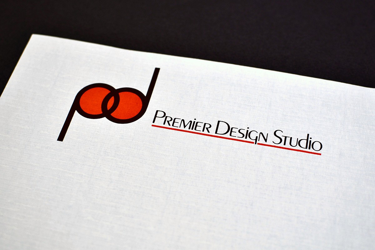
Influenced by the Art Deco revival that swept through the late ’70s and ’80s, the typography leaned heavily on geometric forms and clean symmetry. Rounded letterforms and balanced strokes gave the logo a confident, modern feel—similar in spirit to typefaces like ITC Avant Garde Gothic.
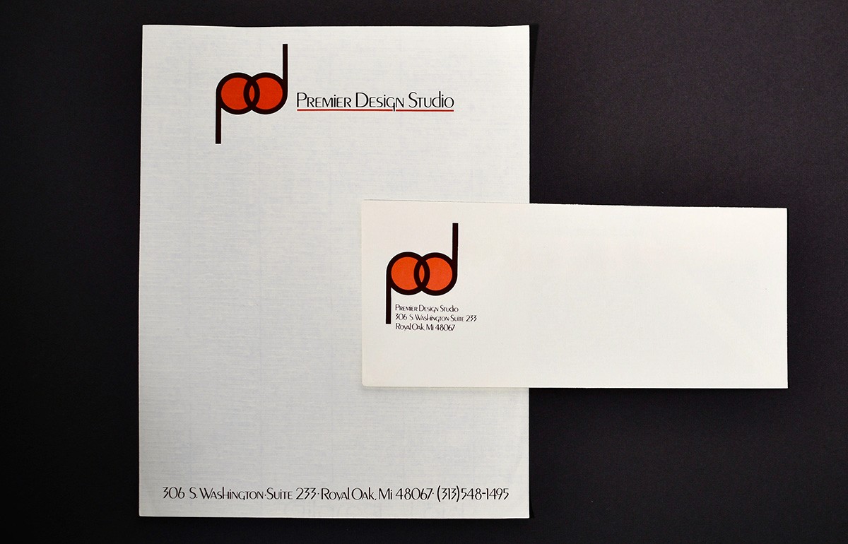
Paired with bold red and black printed on cream paper stock, the design captured the look and energy of boutique design studios at the time. Even today, it’s easy to spot hints of the visual DNA that still exists within our brand.
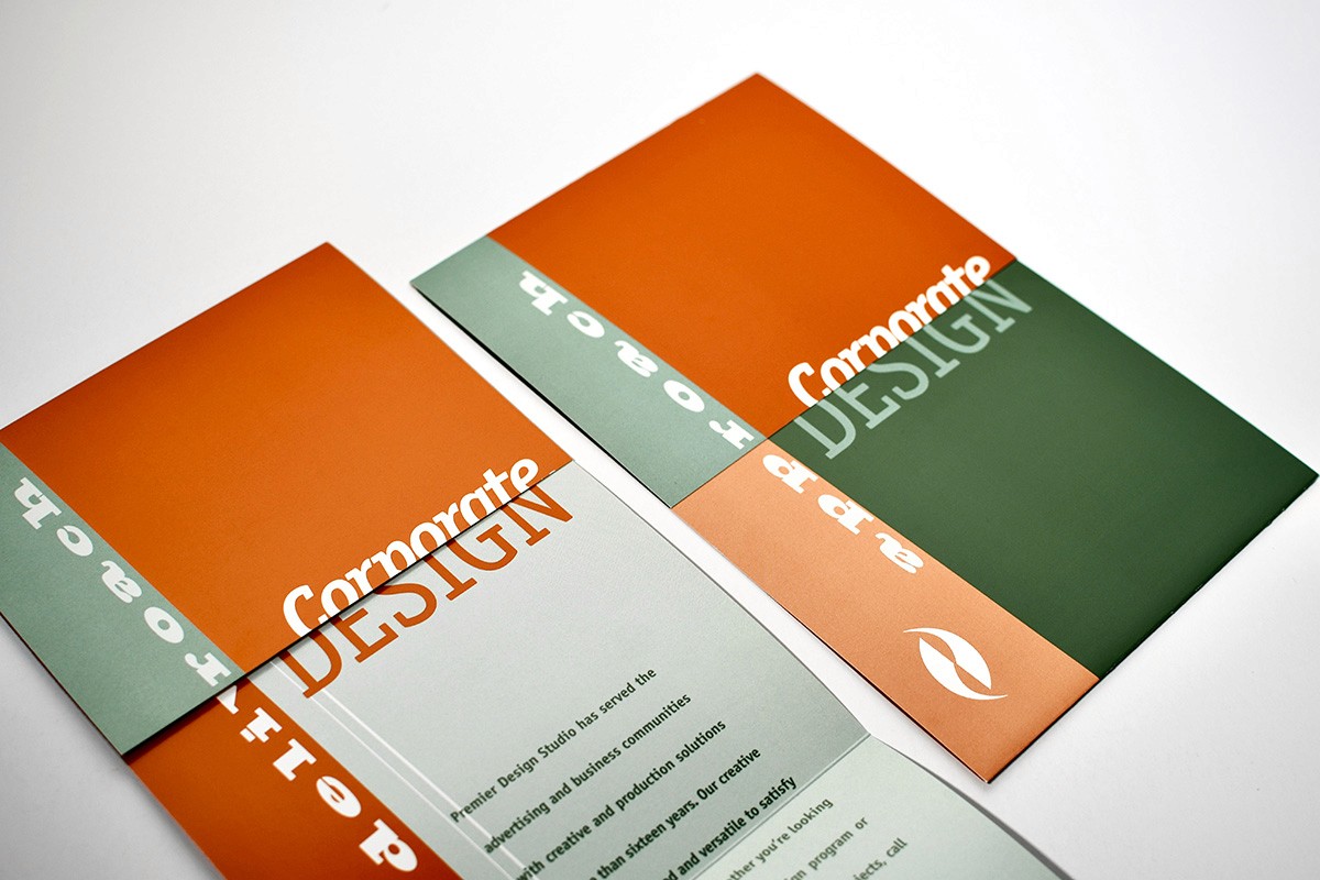
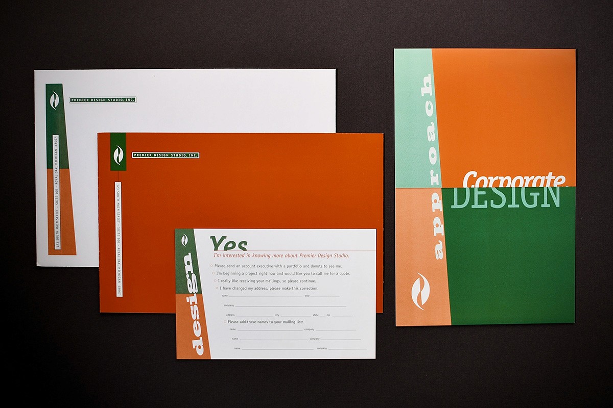
1990: A Move Toward Corporate Identity
By the early 1990s, both the company and the design industry were changing.

Our next logo introduced a more structured identity system. The “pd” monogram became a defining element, framed within a box that gave it a stronger visual weight. The color palette shifted as well. The bold reds of the previous decade gave way to teal—a color that, at the time, felt cooler, more contemporary, and more aligned with corporate branding.
Layouts also became more layered, incorporating bold color blocks, patterns, and graphic framing. This shift mirrored the rapid rise of desktop publishing and digital design tools that were beginning to reshape the creative process.
1992: Creativity Steps Forward
Just a few years later, the brand evolved again.


The “pd” monogram became more stylized and often appeared inside geometric shapes, including a triangle for our 10th anniversary. Teal softened into mauves, purples, and muted pastels. Patterns and textures appeared more frequently, reflecting a studio-driven, experimental approach to design.
Early 2000s: Structure and Order
The early 2000s brought a shift toward clarity. Our brand adopted a structured system with grids, vertical bars, and consistent spacing.


Neutral grays and whites were paired with a single accent color. Clean, modern sans-serif typography reflected the growing digital landscape. Businesses now needed visual systems that were organized and flexible across print and digital.
Mid-2000s: A Burst of Energy
Design shifted again with more dynamic, expressive visuals. Gradients, bold colors, and vibrant layouts became common.
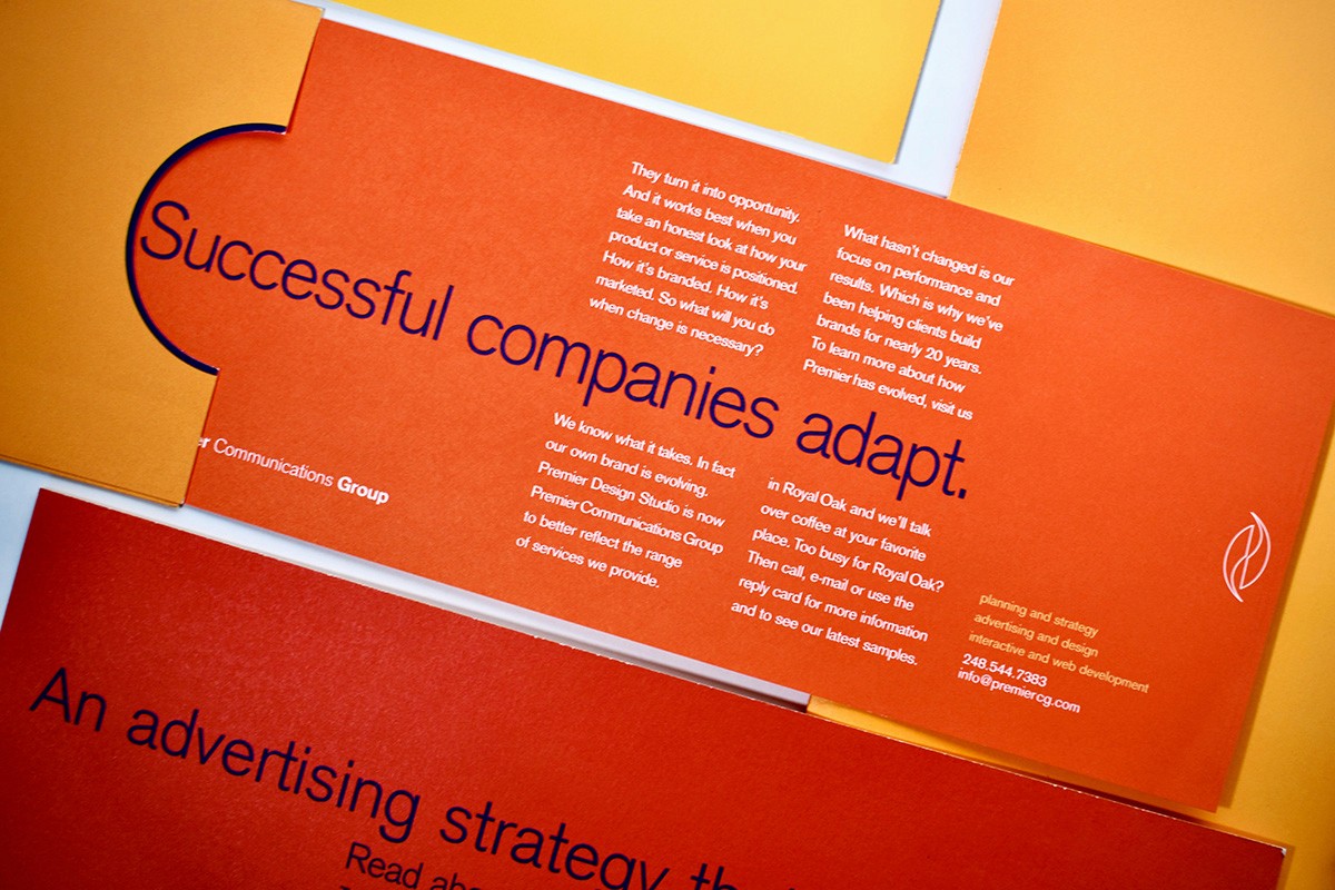
During this period, Premier Design Studio became Premier Communications Group, signaling our expansion beyond traditional design into broader communications. The brand reflected this energy with stronger color blocking and more impactful typography.
The 2010s: Simplicity for a Digital-First World
With smartphones and digital platforms dominating, design trends moved toward simplicity.
Gradients and heavy effects gave way to flat design and minimal systems adaptable to screens of all sizes. Our logo became smaller and more flexible, acting as a subtle signature across materials.
Messaging became more conversational and approachable, emphasizing human-centered communication.
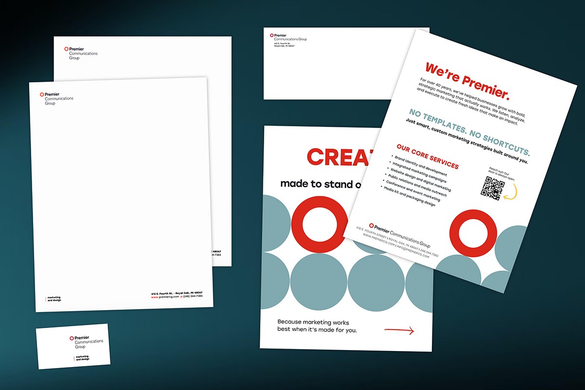
Introducing the Premier Rebrand: A New Look for a Growing Brand
Premier’s new brand marks an important milestone in the company’s continued growth and evolution. Our refreshed visual identity reflects where Premier is today while staying true to the values that have guided us since day one.
Built on strong partnerships, high-quality work, and a commitment to doing things the right way, Premier has earned the trust of clients through decades of reliable service. This rebrand honors that history while positioning Premier for the future.
As our company continues to grow, our new brand better represents who we are today and the direction we’re heading—delivering exceptional work, strengthening client relationships, and continuing to build on the reputation that has defined Premier for years.
Why Reflecting on Your Brand Matters
Revisiting our brand evolution reminded us why history matters in branding. Perspective is key. In business—and life—it’s easy to focus only on the next step. But understanding where you’re going starts with remembering where you began. Your roots reveal the ideas, values, and creative instincts that guided your growth.
Our latest rebrand isn’t about reinventing who we are. It’s about clarity, intention, and appreciation for the history that shaped our company. Progress doesn’t mean leaving the past behind—it means building on it.
Why Consistency Is the Secret Ingredient in Marketing
Everyone wants the big win in marketing. The campaign that takes off. The post that suddenly gets traction. The idea that changes everything overnight.
But in reality, that’s rarely how marketing works.
What actually moves the needle is much simpler and far less flashy: consistency.
At Premier Communications Group, we see it all the time. The brands that grow are not the ones constantly chasing the next new tactic. They are the ones that show up regularly, stick to a clear message, and stay visible even when things feel quiet.
Consistency Builds Trust Before It Builds Leads
People do not buy from brands they do not trust. And trust does not come from a single post or campaign.
When someone sees your brand consistently through blogs, emails, social media, and other channels, something important happens. You start to feel familiar. Familiar feels safe. Safe leads to action.
When marketing is inconsistent, the opposite happens. People start to wonder:
Are they still around?
Do they really know what they are doing?
Can I rely on them?
Consistency answers those questions without saying a word.
You Are Not Repeating Yourself as Much as You Think
We hear this concern all the time: “Aren’t we saying the same thing over and over?”
The truth is, most people are not paying close attention. They are busy. They are distracted. They are scrolling fast.
Seeing your message once is usually not enough. Seeing it a few times, in different ways and in different places, is how it finally sticks.
Consistency is not about copying and pasting the same content. It is about reinforcing your core message so people remember who you are and what you stand for.
Consistency Helps People Find You
There is also a practical side to this.
Search engines and social platforms reward brands that stay active. When you publish content regularly, your visibility improves. Your website performs better. Your brand is easier to find when someone is looking for what you offer.
But beyond algorithms, consistency helps real people remember you. And in marketing, being remembered is half the battle.
It Is Easier to Keep Going Than to Start Over
One of the biggest mistakes businesses make is stopping and starting their marketing.
When you pause, momentum fades. Awareness drops. Engagement slows. When you restart, you are often rebuilding from scratch.
Consistent marketing works differently. Each piece builds on the last. Over time, results become steadier and more predictable.
That is why we focus on systems at PCG, not just one-off campaigns.
Consistency Does Not Mean Selling All the Time
Another common misconception is that consistent marketing means constantly pushing sales.
It does not.
The strongest brands focus on being helpful. They share insight. They educate. They show what they know. When it is time to sell, the audience is already paying attention.
Consistency creates that trust long before the sales conversation ever starts.
The Brands That Win Stay the Course
Marketing is not instant. It is an investment.
The brands that see real results are the ones that commit to the process, even when growth feels slow at first. Over time, consistency turns visibility into credibility and credibility into growth.
How Premier Communications Group Helps Brands Stay Consistent
At Premier Communications Group, we help businesses stay visible without burning out or guessing what to do next.
We do more than create content. We help manage the day‑to‑day consistency that most teams struggle to maintain.
Our work includes:
Strategic content development
Clear, focused brand messaging
Ongoing digital marketing execution
Long-term visibility and growth support
We act as an extension of your team, making sure your marketing keeps moving even when your internal priorities shift.
Ready to Stop Starting Over?
If your marketing feels inconsistent, reactive, or hard to sustain, it might be time for a different approach.
Partner with Premier Communications Group
Let’s build a marketing system that shows up consistently, builds trust, and supports real business growth.
Your Brand Has Sprouted – What's Next?
Congratulations on getting your brand off the ground! You've taken important steps: defining who you are, investing in creative efforts, launching a new website, or refreshing your messaging. In essence, your brand has begun to grow.
But here’s the exciting part: what comes next can make all the difference. Many businesses find that the momentum from a launch can slow down if they're not careful.
It’s common to see organizations treat the launch of their branding or website as the finish line. However, it’s really just the beginning of a journey. Continued growth comes from ongoing support and engagement.
Why Staying Consistent Matters More Than Just Launching
Think of consistency as the key to turning initial excitement into lasting success. When your brand appears differently on each channel or suddenly goes quiet, trust can start to fade. Your audiences notice these gaps, even before you might realize.
Remember, consistent marketing doesn’t mean repeating the same message everywhere. Instead, it’s about consistently sharing your core story, values, and what makes you unique. Every touchpoint should feel connected, thoughtful, and unmistakably yours.
The brands that keep growing are the ones that keep showing up.
Working Hand-in-Hand: Your Website and Social Media
Your website is like the heart of your brand; it hosts your story, builds credibility, and drives action. Social media is how you invite people to join the story.
When they work together, they create a beautiful cycle: social content brings visitors, your website offers more details and converts curiosity into action, and consistent messaging across both builds trust.
But when they’re out of sync, it can feel disjointed. Social posts seem random, the website feels stuck, and you might miss chances to connect.
Why Many Stop Too Soon
After a big launch, it’s tempting to take a breather. Budgets shift, attention turns inward, and marketing can become more reactive than strategic.
But real growth isn’t a quick burst; it’s built through consistent effort, repetition, and improvement. Halting too early can mean your investment isn’t fully realized. Your brand is there, but without ongoing nurturing, it might not reach its full potential.
Persistent work turns a promising start into real, measurable results.
What Continuous Marketing Looks Like
Ongoing marketing doesn’t mean doing everything at once. It’s about focusing on the right activities, day after day.
This might involve:
Regularly sharing your brand story across channels
Using your website actively, not just as a static page
Supporting campaigns with cohesive messaging
Tracking results and making smart adjustments
The most successful brands think of marketing as a connected system, not just a series of one-time projects.
Growth Needs Nurturing, Not Rushing
Just like anything that flourishes, brands need attention, patience, and the right environment. Launching is just the start; nurturing is the magic that keeps growth happening.
If your brand has sprouted, ask yourself: it’s not just about what you’ve built, but how you’ll support it moving forward.
That’s where the real growth begins.
Before You Plant: The Questions Every Business Should Ask Before Marketing
In our last post, From Seed to Harvest, we discussed how marketing, like farming, is a process. You plant thoughtfully, nurture consistently, and patiently wait for results. But there’s an even earlier step many businesses skip.
Before you plant anything, you need to prepare the ground.
You wouldn’t walk into a field, toss seeds over your shoulder, and hope for a harvest. You’d test the soil, choose the right crops, and plan for water, sun, and care.
Marketing works the same way.
Before launching a campaign, redesigning your website, or signing up for the latest “must-have” platform, every business should ask critical questions. The answers help form your marketing plan: the foundation everything else is built on.
1. What Are We Actually Trying to Grow?
Marketing without clear goals is just busywork, lacking direction and purpose.
Before you spend a dollar, ask:
Are we trying to generate leads?
Increase brand awareness?
Drive online sales?
Support our sales team?
Enter a new market or launch a new service?
Each goal requires a different approach. Building brand awareness might call for storytelling and visibility. Generating leads may require landing pages, email follow up, and paid campaigns. Supporting sales could focus on helpful content, case studies, and automation.
If you can’t clearly define success, you won’t know whether your marketing is working or why it isn’t working.
Good marketing doesn’t start with tactics. It starts with intent.
2. Who Are We Planting For?
Seeds don’t grow in every environment, and your message won’t resonate with everyone.
Too many businesses try to market to “everyone” and end up reaching no one.
Ask yourself:
Who is our ideal customer?
What problems keep them up at night?
Where do they get information?
What motivates them to take action?
Your audience determines:
Which platforms you should use
How formal or conversational your messaging should be
What content will educate or persuade them
If you don’t know who you’re speaking to, your marketing will sound generic, and generic marketing gets ignored.
3. What Are We Growing Toward?
Awareness is only useful if it leads somewhere.
Every piece of marketing should guide people toward a clear next step:
Schedule a consultation
Download a guide
Subscribe to a newsletter
Request a quote
Visit a location
Make a purchase
Without a defined action, your marketing is like watering a field with no crops planted.
This question also reveals gaps:
Do you have a strong call to action?
Is your website built to convert?
Are there clear paths for users to follow?
If you’re not sure what you want your audience to do, they won’t be sure either.
4. What Are We Already Growing With?
Not every business needs everything.
Before adding new services, tools, or platforms, take inventory of what you already have:
Existing website and content
Email lists and CRM systems
Social media presence
Analytics and reporting tools
Internal capacity to manage marketing
Then ask:
What’s working?
What’s underperforming?
What’s missing entirely?
Marketing is most effective when it’s focused. Spreading resources too thin across every channel, trend, or tool often leads to wasted effort and poor results.
The goal isn’t more marketing. The goal is the right marketing.
5. What Are We Ready to Nurture?
Seeds don’t grow without consistent care, and marketing doesn’t work without real investment.
That investment may include:
Budget
Time
Internal staffing
External partners
Patience
Marketing rarely delivers instant results. It grows over time. Businesses that achieve long-term success are those willing to nurture their efforts consistently rather than pulling the plug too early.
Be honest with yourself:
What can we sustain for 3, 6, or 12 months?
Are expectations realistic?
Who is responsible for managing this internally?
A modest, well-managed plan will outperform an ambitious one that can’t be maintained.
6. How Will We Measure Growth?
You wouldn’t plant something without checking on it along the way.
Before launching, define:
Key performance indicators (KPIs)
Benchmarks for success
Reporting cadence
This might include:
Website traffic
Conversion rates
Cost per lead
Email engagement
Sales-qualified leads
Measurement doesn’t just prove ROI; it helps you improve. When you know what’s working (and what isn’t), you can adjust before small issues become big problems.
Preparing the Soil for Growth
Marketing isn’t magic. It’s a system.
When businesses skip planning phase, they often blame the tactics:
“SEO didn’t work.”
“Social media didn’t help.”
“Paid ads were a waste of money.”
In reality, the issue usually lies in what happened before anything was planted.
When goals are clear, audiences are defined, and expectations are aligned, marketing stops feeling like guesswork and starts delivering measurable growth.
Ready to Plant the Right Seeds?
At Premier, we believe strong marketing starts with strong questions. Our role isn’t just to execute; it’s to help you clarify, prioritize, and build a plan that fits your business today and supports where you want it to grow.
Because when the soil is prepared, the harvest comes naturally.
If you’re ready to take the next step — from planning to planting to growing — we’d love to talk.
From Seed to Harvest: Why the Best Marketing Starts Small
When people think about successful marketing, they usually imagine something big. A major campaign. A big launch. Everything is hitting at once.
That’s a little like expecting a tomato plant to thrive because you bought the biggest pot and dumped a lot of fertilizer on day one.
In reality, the best marketing, like the best gardens, starts small.
It starts with a seed. With patience. By paying attention to what actually helps an idea grow.
You Can’t Skip the Early Stages
One of the most common marketing mistakes is trying to do everything at once. New website. New message. New campaigns. All rolled out together, quickly.
But when you slow down and ask a few basic questions, it’s often clear the foundation isn’t ready yet:
Who are we really trying to reach?
What problem are we solving for them?
What do we want them to understand or do next?
If those answers aren’t clear, scaling doesn’t help. It’s like planting seeds without checking the soil. You can water all you want, but growth is still uneven or doesn’t happen at all.
Starting small forces you to prepare the ground before expecting results.
Small, Consistent Work Is What Actually Grows Results
Strong marketing usually begins with simple, foundational steps:
Tightening your core messaging
Improving one key page or service
Ensuring your business shows up clearly in local search
Answering the questions people keep asking you anyway
None of that feels flashy. But it’s the equivalent of daily watering, sunlight, and pruning. It’s what allows growth to happen steadily rather than all at once or not at all.
When messaging is clear, content becomes easier to create.
When content is intentional, SEO has something solid to work with.
When people can find and understand you, engagement follows naturally.
That’s how momentum builds: slowly at first, then all at once.
Clarity Is the Soil Everything Grows In
Creativity matters. But clarity matters first.
If someone lands on your website, sees a social post, or hears about you through a referral, they should quickly understand who you are, what you do, and why it matters. If that’s unclear, no number of clever campaigns will fix it.
Good marketing doesn’t try to grow everything at the same time. It focuses on what needs attention now, recognizing that stronger growth will come later.
Once the foundation is healthy, scaling feels less risky and far more productive.
Sustainable Marketing Takes Time
Anyone who’s grown tomatoes knows this: you don’t get fruit the week after planting. You get it after consistent care, adjustments, and a little patience.
The same is true with marketing.
Starting small gives you room to:
See what actually resonates
Adjust before investing more
Build systems that support long-term growth
Avoid burning out your team or your audience
Marketing isn’t a single launch. It’s a growing season. And the strongest strategies are designed to produce over time, not spike once and fade.
Why This Approach Matters Right Now
With AI, shifting search behavior, and shorter attention spans, clarity and consistency matter more than ever. People and platforms reward brands that are easy to understand and consistent in how they show up.
Starting small doesn’t mean thinking small.
It means thinking strategically.
The best marketing isn’t about how much you do.
It’s about whether what you’re doing can actually grow.
And just like a good harvest, that always starts with the right seed.
Consistency Is the Strategy More Brands Are Missing
In 2026, attention is even more fragmented, and trends are going move fast. But consistency is what will create recognition and trust. The brands that stand out aren’t constantly reinventing themselves; they’re reinforcing who they are. Take a step back and remember what your brand stands for and why you do what you do.
That consistency shows up everywhere: in voice, in design, in how messages are framed, and in the experiences created around them. When every touchpoint feels connected, audiences don’t have to work to understand the brand—it just makes sense. And in a fast-paced world, it’s like a breath of fresh air when something just makes sense and clicks into place.
This doesn’t mean things have to stay static. It means growth happens within a clear framework. When strategy, visuals, and messaging are aligned, campaigns become easier to build and stronger in impact. In a crowded landscape, consistency isn’t playing it safe—it’s what allows brands to move forward with confidence. If your brand needs a boost of consistency and growth, Reach out to us!
A Few Marketing Shifts We’re Watching for 2026
We predict that even with AI and technology advancing fast, marketing in 2026 will feel more human than ever. Brands that stand out aren’t going to be the loudest—they’re going to be the ones that feel intentional, thoughtful, and real.
Personalization is no longer a “nice to have.” People expect relevance. Whether it’s a message, an experience, or a moment, audiences want to feel seen, not grouped into a generic bucket – and audiences are noticing this difference more than ever.
There’s also a noticeable move toward quality over quantity. Fewer touchpoints, but better ones. Brands are slowing down and carefully choosing materials, language, and experiences that feel considered rather than rushed.
Sustainability and ethics continue to matter—but now they’re expected. Where things are made, how they’re sourced, and who they support are all part of the story, whether brands say it out loud or not.
And finally, the most compelling marketing feels cohesive. Not a collection of disconnected tactics, but one clear story told across moments that actually bring people together.
As we head into 2026, the brands that resonate will be the ones that know who they are, why they exist, and how to communicate that with intention.
Our team at Premier is here to help you plan your 2026 communications calendar to align creative, content, and promo strategies under one cohesive plan. Reach out to us and let’s get to planning!
