
How Premier’s Logo Evolved: A 40-Year Journey of Brand Growth
Understanding Brand Evolution: Why Your Logo Tells Your Story
Every company has a story, and your logo is often the first visual chapter. At Premier, we’ve been refining our brand identity for over 40 years. With each logo redesign, we asked the same questions: What’s new? What’s timeless? How can our brand reflect who we are today while honoring our history?
A brand refresh isn’t just about a new logo or color palette. It’s about clarity, intention, and capturing the growth of a company over time. Before moving forward, we took a step back to revisit where it all began.
Digging Into Our Branding History
As the process began, we opened the Premier archives. Old stationery. Early logos. Campaign pieces from years past. Some of it had a bit of dust on it—but it also carried decades of history.
Each piece represented a moment in time. A design choice. A milestone. A snapshot of where the company was and where the design world was heading. Over four decades, those moments quietly build a visual timeline of a brand. To understand where we are today, it helps to see where it all started.
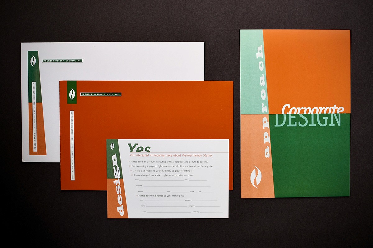
1984: The Beginning of Premier’s Brand
Our earliest logo reflected the design trends of the early 1980s almost perfectly.
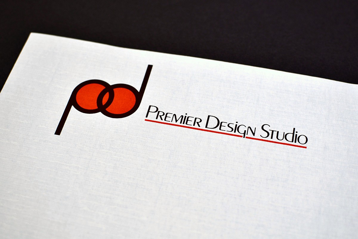
Influenced by the Art Deco revival that swept through the late ’70s and ’80s, the typography leaned heavily on geometric forms and clean symmetry. Rounded letterforms and balanced strokes gave the logo a confident, modern feel—similar in spirit to typefaces like ITC Avant Garde Gothic.
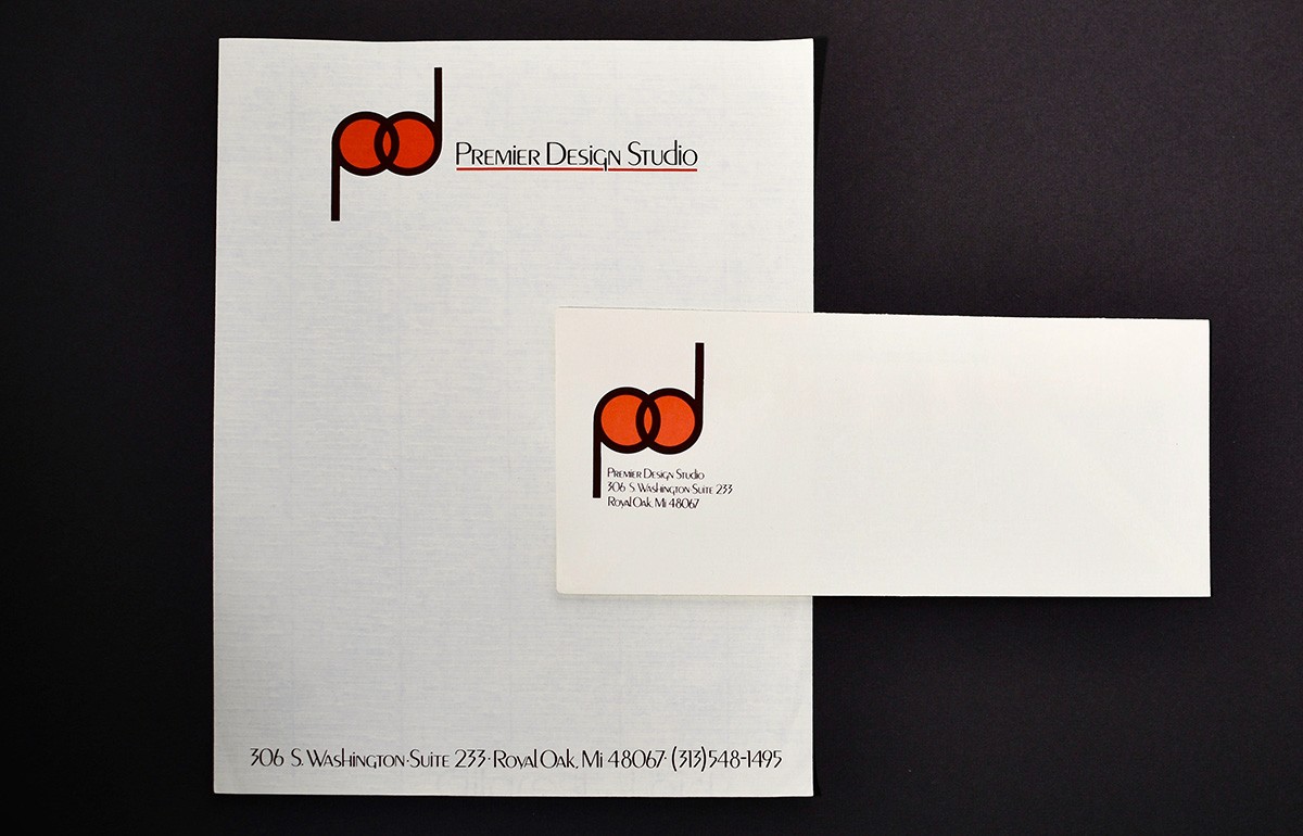
Paired with bold red and black printed on cream paper stock, the design captured the look and energy of boutique design studios at the time. Even today, it’s easy to spot hints of the visual DNA that still exists within our brand.
1990: A Move Toward Corporate Identity
By the early 1990s, both the company and the design industry were changing.
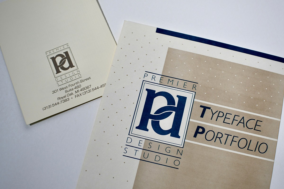
Our next logo introduced a more structured identity system. The “pd” monogram became a defining element, framed within a box that gave it a stronger visual weight. The color palette shifted as well. The bold reds of the previous decade gave way to teal—a color that, at the time, felt cooler, more contemporary, and more aligned with corporate branding.
Layouts also became more layered, incorporating bold color blocks, patterns, and graphic framing. This shift mirrored the rapid rise of desktop publishing and digital design tools that were beginning to reshape the creative process.
1992: Creativity Steps Forward
Just a few years later, the brand evolved again.
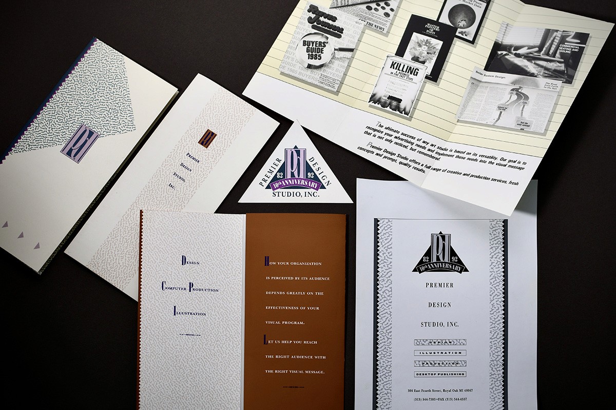
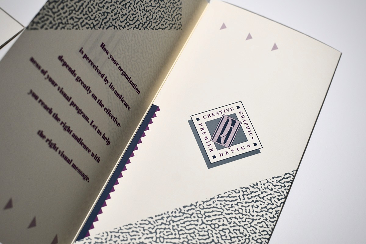
The “pd” monogram became more stylized and often appeared inside geometric shapes, including a triangle for our 10th anniversary. Teal softened into mauves, purples, and muted pastels. Patterns and textures appeared more frequently, reflecting a studio-driven, experimental approach to design.
Early 2000s: Structure and Order
The early 2000s brought a shift toward clarity. Our brand adopted a structured system with grids, vertical bars, and consistent spacing.
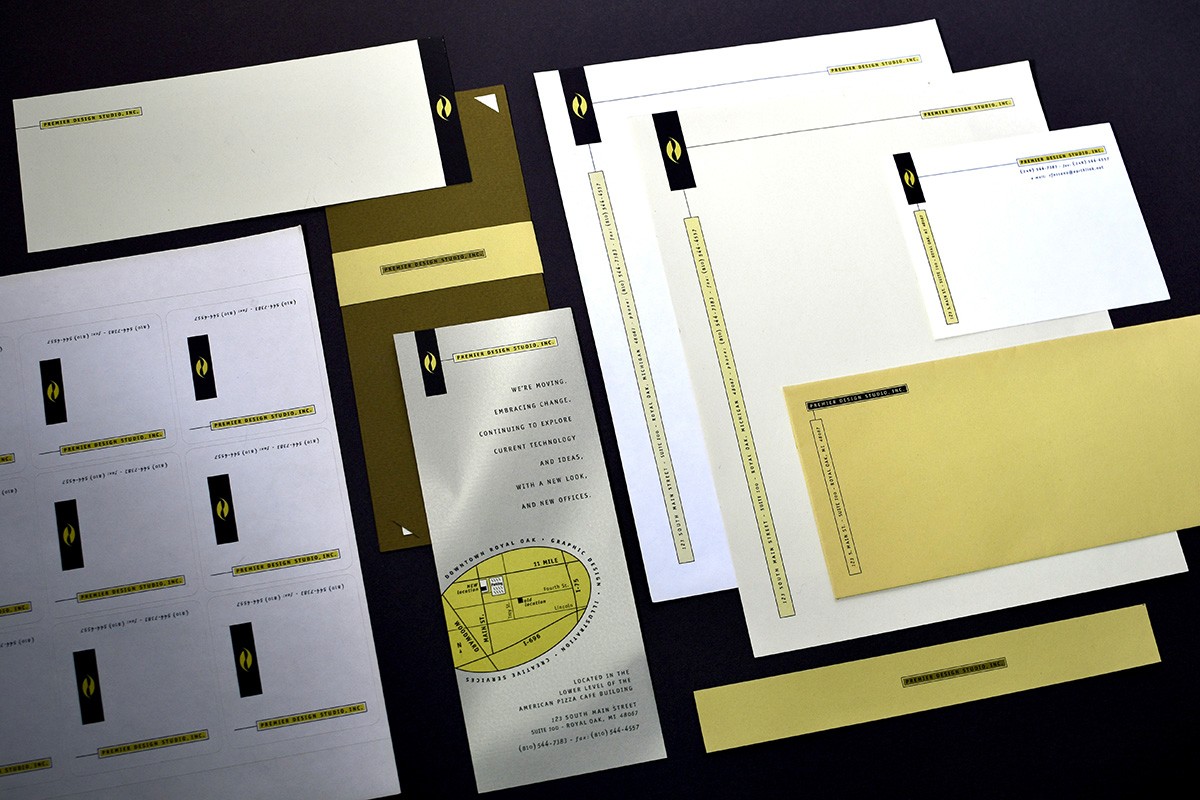
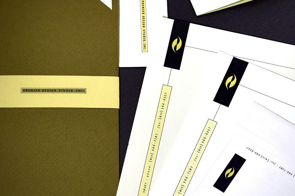
Neutral grays and whites were paired with a single accent color. Clean, modern sans-serif typography reflected the growing digital landscape. Businesses now needed visual systems that were organized and flexible across print and digital.
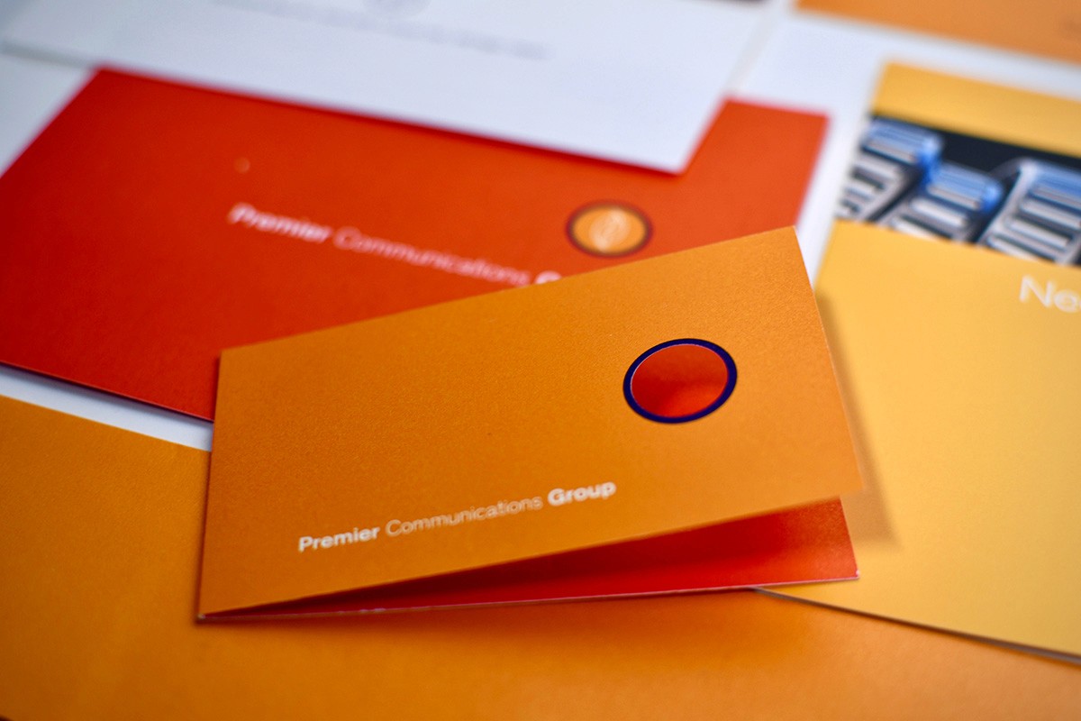
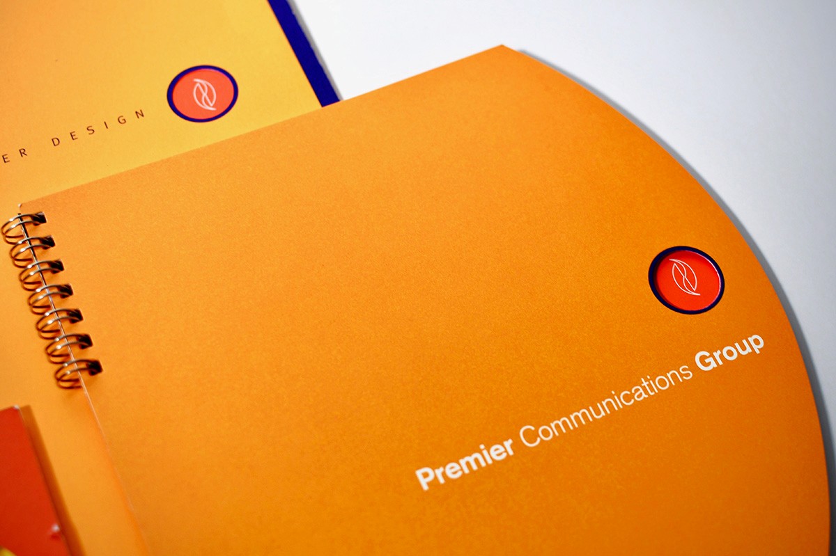
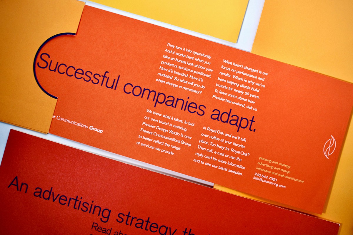
Mid-2000s: A Burst of Energy
Design shifted again with more dynamic, expressive visuals. Gradients, bold colors, and vibrant layouts became common.
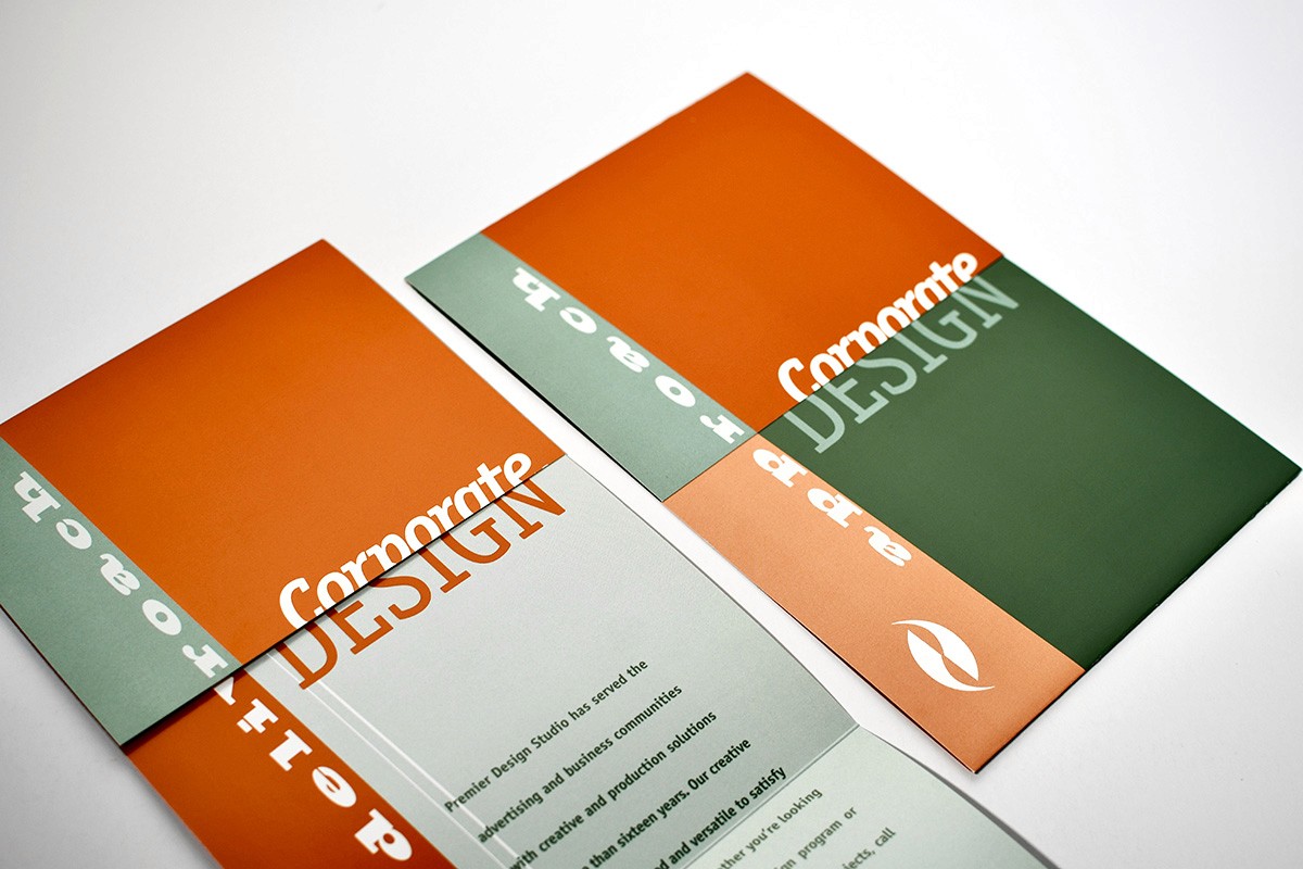
During this period, Premier Design Studio became Premier Communications Group, signaling our expansion beyond traditional design into broader communications. The brand reflected this energy with stronger color blocking and more impactful typography.
The 2010s: Simplicity for a Digital-First World
With smartphones and digital platforms dominating, design trends moved toward simplicity.
Gradients and heavy effects gave way to flat design and minimal systems adaptable to screens of all sizes. Our logo became smaller and more flexible, acting as a subtle signature across materials.
Messaging became more conversational and approachable, emphasizing human-centered communication.
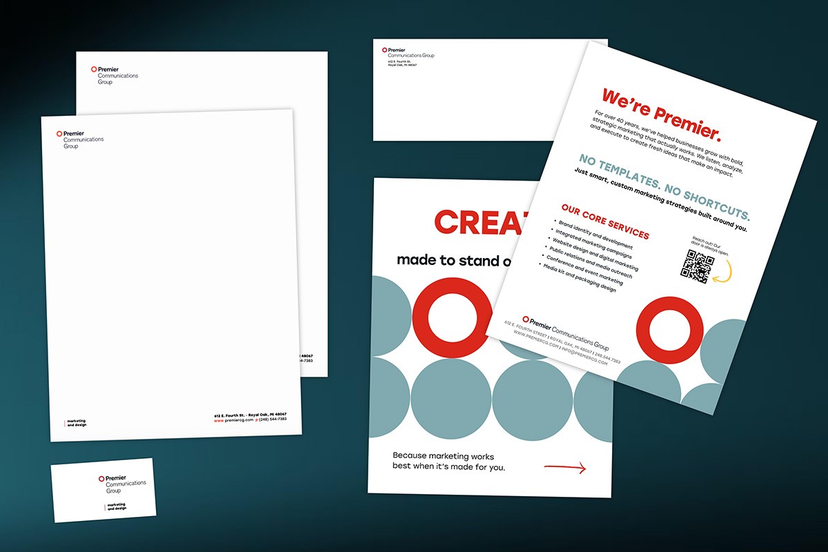
Introducing the Premier Rebrand: A New Look for a Growing Brand
Premier’s new brand marks an important milestone in the company’s continued growth and evolution. Our refreshed visual identity reflects where Premier is today while staying true to the values that have guided us since day one.
Built on strong partnerships, high-quality work, and a commitment to doing things the right way, Premier has earned the trust of clients through decades of reliable service. This rebrand honors that history while positioning Premier for the future.
As our company continues to grow, our new brand better represents who we are today and the direction we’re heading—delivering exceptional work, strengthening client relationships, and continuing to build on the reputation that has defined Premier for years.
Why Reflecting on Your Brand Matters
Revisiting our brand evolution reminded us why history matters in branding. Perspective is key. In business—and life—it’s easy to focus only on the next step. But understanding where you’re going starts with remembering where you began. Your roots reveal the ideas, values, and creative instincts that guided your growth.
Our latest rebrand isn’t about reinventing who we are. It’s about clarity, intention, and appreciation for the history that shaped our company. Progress doesn’t mean leaving the past behind—it means building on it.
